A New Symbol, The Same Soul
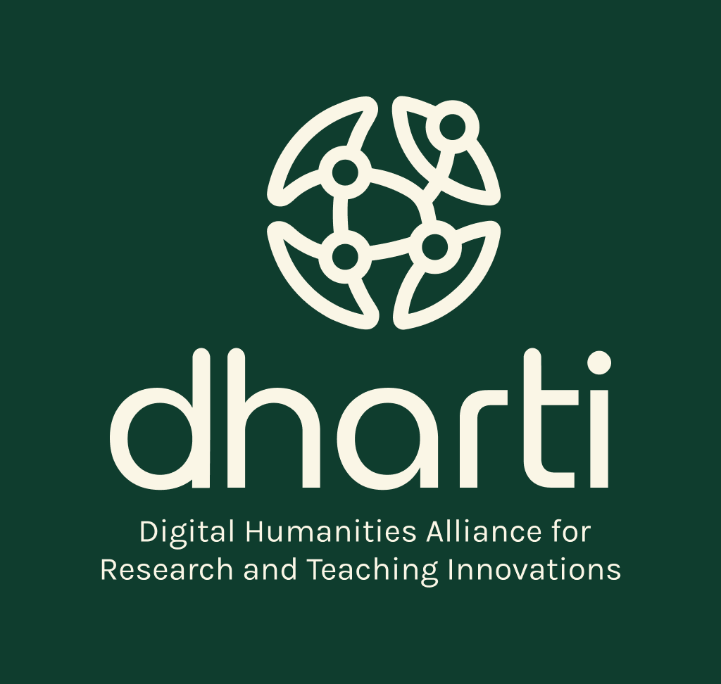
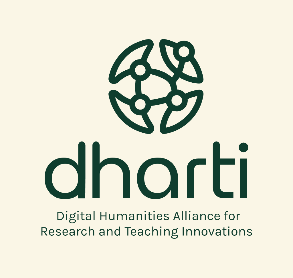
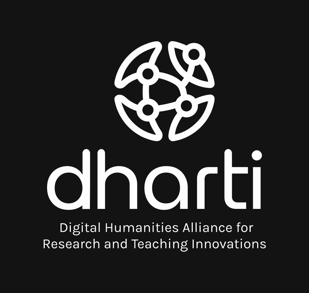
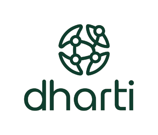
Every logo that comes to represent an institution carries within it a small history of deliberation, of choices weighed and set aside, and of a community deciding, together, what it wishes to be seen as. DHARTI’s new logo is one such mark, born of a collective process and now offered as a lasting emblem of who we are.
The logo emerged out of a Logo Design Competition that DHARTI conducted between March-April, 2026, inviting members of the community to submit their own visions of what our visual identity could look like. The response was heartening in both its volume and its thoughtfulness, with participants bringing perspectives shaped by design, technology, and the humanities alike, each entry a small essay in itself on what DHARTI means to those who engage with it.
The winning entry was submitted by Tushar Kant, whose design was selected for the manner in which it distilled DHARTI’s values into a single, cohesive visual form. His work stood out for the way it wove together humanistic and technological registers within one unified geometry, offering a mark that was as conceptually rich as it was visually restrained. We remain deeply grateful to him, as we do to every participant whose creativity shaped this process.
The task of adjudicating the competition fell to a panel whose expertise spans design pedagogy and practice: Prof. Subir Dey (Department of Design, IIT Delhi) and Prof. Saurav Deori (Department of Design, IIT Hyderabad). Their careful deliberation over the submitted entries, and the generosity of their time and insight, were instrumental in arriving at a design that could speak meaningfully for the organisation.
What the Logo Represents
In Tushar’s own words:
The conceptual foundation of the logo comes from the idea of a “Unified Knowledge Ecosystem”. The logo mark is shaped as a spherical structure, representing Earth and symbolising a shared intellectual ground. It is composed of four interconnected elements arranged as two corresponding sides: the left side, with its inward-curving forms, suggests humanistic inquiry (interpretation, culture, and lived knowledge), and the right side, with its structurally geometric forms, symbolises the organised systems (digital methods, tools, and research practices).
All elements are derived from the same geometry and connected by a network of pathways, which represents DHARTI’s mission to forge alliances, support research communities, and integrate digital practices into humanities scholarship. The subtle asymmetry, visible in the nodes, showcases “Innovation” (the breaking of traditional boundaries) and the evolving nature of research. The minimal design ensures scalability and adaptability across both digital and print media.
A New Chapter
The new mark, then, is less a departure than a continuation, the same soul finding a new symbol through which to speak. It carries forward DHARTI’s ongoing journey of connecting people, knowledge, and culture, even as the organisation itself enters a new and significant chapter.